In creating the "Where is it hottest in Miami-Dade County?" map, I ran into several challenges and
unknowns. While vector temperature data exists
for county averages, I needed to use remote satellite data to make this county map on the more granular
level.
Remote sensing data is anything but
pretty. It's traditionally difficult to map raster data due to the large file sizes of geoTIFFs.
For this map, I learned how to use Google Earth Engine to pull in remote sensing data. I used GEE to
calculate the average land surface temperature of Miami-Dade County based on each day of summer 2021. I
exported the data as a geoTIFF, which I brought into QGIS, where I trimmed the data precision, aggregated
similar values, and recasted my raster data as vector data. From here, I exported a geojson file and
brought that file into Flourish.
I chose the color scheme carefully for this map. I did not want to create an alarmist graphic, but I
wanted to use colors that were both accessible and could accurately depict the reality of the situation.


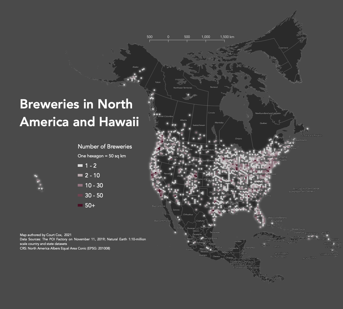 Made in summer 2021, this is one of my earliest mapping projects, made for MAP 671: Introduction to New
Mapping.
Made in summer 2021, this is one of my earliest mapping projects, made for MAP 671: Introduction to New
Mapping.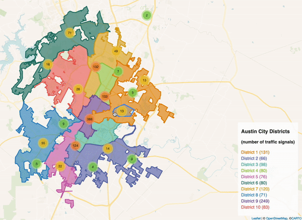
 This map was made to support